Small-looking text in apps with no size setting
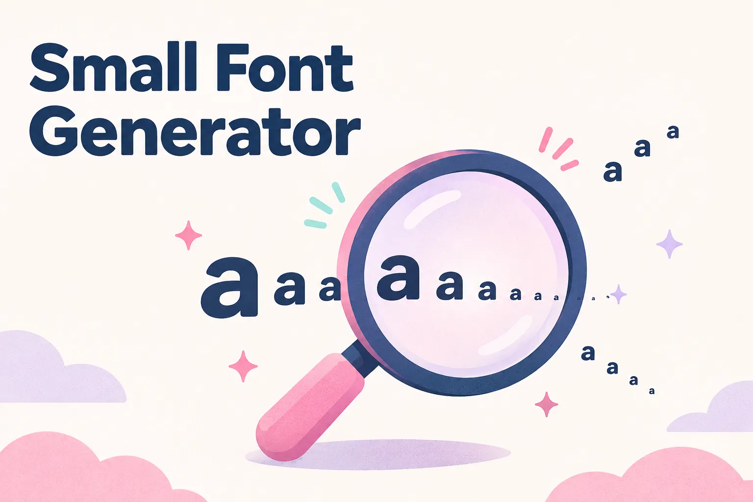
Instagram, TikTok, and most chat apps give you one text size and no way to change it. This small font generator works around that by swapping your letters for characters that are drawn small: small capitals, raised superscript letters, and lowered subscript letters. Type a word, and the five Small styles lead the results, mixed in with framed versions that start with soft symbols such as ✧ and ❀.
Take tiny text as an example. It comes out as ᴛɪɴʏ ᴛᴇxᴛ in small caps, ᵗⁱⁿʸ ᵗᵉˣᵗ in superscript, and ₜᵢₙᵧ ₜₑₓₜ in subscript. Click any card or its Copy button and the result goes to your clipboard, ready to paste into a bio, caption, or display name. For a slanted script look instead, the cursive letters generator has a copyable A to Z chart.
The five Small styles and what each is good for
The Small group in the sidebar holds five styles, and the framed cards after them reuse the same five inside soft frames from moods such as Beautiful, Clean, and Cute. They look related, but they behave differently once you paste them, so pick by job rather than by looks alone.
- Small caps (ᴛɪɴʏ ᴛᴇxᴛ): capital shapes at lowercase height. The easiest to read, so it suits names and short headings.
- Superscript (ᵗⁱⁿʸ ᵗᵉˣᵗ): letters raised like a footnote. Good for a quiet aside such as ᵗʰᵃⁿᵏ ʸᵒᵘ.
- Subscript (ₜᵢₙᵧ ₜₑₓₜ): letters dropped below the line. The least complete set, so short words only.
- Spaced small caps (ᴛ ɪ ɴ ʏ): small caps with a gap after every letter, for a light, airy heading.
- Tiny wave (ᵗᵢⁿᵧ ₜᵉₓᵗ): alternates raised and lowered letters for a bouncing look. Decoration, not reading text.
Where the tiny letters come from
None of these characters were made for styling. Small capitals like ʀ and ɴ come from phonetic alphabets, where they stand for particular speech sounds. Most superscript letters are modifier letters from the same tradition: a raised ʰ, for instance, marks a puff of breath after a consonant. Superscript and subscript digits were added for maths, chemistry, and footnotes. A small font generator simply gathers these scattered characters into something that looks like one alphabet. The upside down text generator borrows from the same phonetic alphabets to turn letters over.
The gaps: no clean superscript q, almost no subscript
Because nobody designed a full tiny alphabet, some letters are missing and have to be borrowed. Lowercase q has no well-supported superscript form, so the tool uses ᑫ from Canadian syllabics. Capital C, F, S, X, Y, and Z fall back to their raised lowercase shapes, and a capital Q becomes ǫ, which is not raised at all.
Subscript is far patchier. There are no subscript capitals in common use, so capitals stay full size: Night Owl becomes Nᵢ𝓰ₕₜ O𝓌ₗ. Several lowercase letters have no subscript either. The tool fills b, q, and y with subscript Greek letters (ᵦ, ᵩ, ᵧ), and c, d, f, g, w, and z with script letters that sit on the normal line. That is why quiet turns into ᵩᵤᵢₑₜ and why some words look uneven in subscript.
If one letter looks out of step with the rest, that is the reason, and no setting will fix it. The only cures are choosing a different word, typing it in lowercase so the capitals stop standing out, or picking another style. Small caps has the fewest gaps by far, which is why it comes first in the results.
Small caps quirks with f, q, s, and x
Even small caps borrows a little. This small font generator writes f as ғ, a Cyrillic letter with the right shape, and q as ǫ, a Latin o with a hook that reads as a small Q. The letters s and x stay as ordinary lowercase, because at that height they already look like small capitals. Typed capitals and lowercase both give the same result, so ʀᴇғʟᴇᴄᴛɪᴏɴ looks identical whether you type Reflection or REFLECTION. The Roblox font generator opens on these same small caps, with a 20-character filter for display names.
Numbers stay at normal size in small caps, which can look slightly loud next to the shrunken letters. If you want small digits, the superscript card turns 2024 into ²⁰²⁴ and subscript gives ₂₀₂₄. Both sets of digits are complete, unlike the letters, so numbers are the one place subscript is fully reliable.
Tiny letters do not make text shorter
This catches a lot of people out. A small letter is still one character, so ᴛɪɴʏ ᴛᴇxᴛ uses the same 9 characters as tiny text. The spaced card nearly doubles that, to 17, because every gap counts. Wide vaporwave text works the same way, with every added space counting toward the limit. Small text will not help a long bio fit under a limit.
A few borrowed letters also cost more in apps that count UTF-16 units, the way much software stores text. The script letters used to fill subscript gaps are two units each, so Night Owl in subscript is 9 characters but 11 units. Small caps and superscript avoid that, since every one of their characters is a single unit.
Readability on phones and with screen readers
Superscript and subscript are genuinely small, which is the point, but on a phone in a busy feed they can be hard to make out, especially in thin fonts on dark mode. Keep them to a word or two and put anything people need to read, such as a link or a handle, in normal text.
Screen readers handle these characters unevenly. Some read small caps close to normal, while others announce each phonetic letter by name or skip it, and the borrowed Greek and script letters can sound odd. If accessibility matters for a profile, use small caps for the styled part and keep the important details plain.
Good places for small text
Small text works best as a second voice beside normal text, not as the main one. It gives a profile some hierarchy, the way a smaller line under a heading does in print, without needing a size setting the app does not have. To lay out a whole bio with dividers and a character counter, use the aesthetic bio symbols builder.
- A small caps tagline under your name in a bio.
- A superscript sign-off at the end of a caption, like ᵗʰᵃⁿᵏ ʸᵒᵘ.
- A display name on a platform that shows names large, where small caps stays readable.
- Superscript digits for a year or a footnote-style number.