Text that looks wrong on purpose
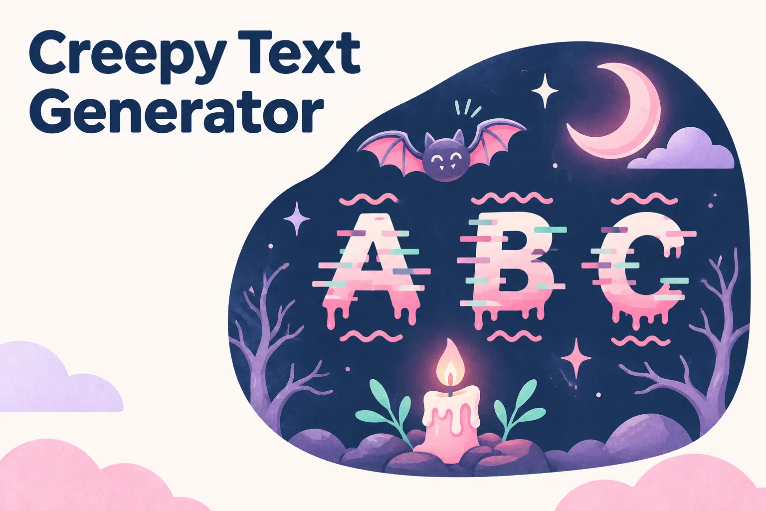
A creepy text generator piles marks onto your letters until the words look scratched, dripping, or corrupted, the kind of text you see in horror game titles and Halloween posts. Type a short phrase, drag the Intensity slider, choose where the marks go, and copy the card you like. The result is plain text, so it pastes into captions, chats, and display names without an image or a font setting.
Because there are only a few controls, it is quick to compare settings. Every change rebuilds the cards at once, and the counter on each card shows exactly how long the result has become. Press Ideas for ready-made phrases such as Behind You or Lights Out if you need a starting point.
How combining marks make the corrupted look
The effect is often called Zalgo text, after an internet horror meme. It relies on combining marks: characters designed to attach to the letter before them, like the accent on é. Real languages rarely use more than one or two on a letter, but Unicode sets no limit, so stacking many of them makes a letter sprout marks that climb out of its line.
All the marks this tool uses come from the Combining Diacritical Marks block. It draws on about thirty that sit above a letter, eighteen that cut through it, and nearly forty that hang below. The marks are chosen by their position in your text, not at random, so the same words with the same settings always give exactly the same result.
What the Intensity slider actually does
The slider runs from 1 to 8 and starts at 2. It sets how many marks each letter gets in each zone. At level 1 every letter gets one. From level 2 up, letters alternate between the full number and one fewer, which keeps the stacks uneven and less mechanical. Here is how a three-letter word, Run, grows:
- Level 1, Above only: 6 characters, slightly off
- Level 2, Above only: 8 characters, clearly wrong but readable
- Level 2, Everywhere: 17 characters, messy and hard to ignore
- Level 8, Everywhere: 71 characters, more mark than letter
Above, Through, Below or Everywhere
The direction buttons pick which set of marks is used. Above gives a crown of spikes and accents, good for something that looks like it is rising or buzzing. Below makes letters look as if they are melting or dripping. Through runs strokes and slashes across the middle, which reads as scratched or censored. Everywhere uses all three at once and gives the classic full corruption.
The first four cards always show all four directions, with the one you selected first. The next four apply your settings to bold Old English, bold, monospace, and small caps letters, which give the marks a different base to sit on. For blackletter on its own, without marks, the Old English font generator has weight and case options. After those come framed cards using spooky symbols such as ☠, 🕯, and ⚰.
Pick the intensity for where you are posting
Levels 1 and 2 stay readable and still feel wrong, which is often scarier than a wall of noise. If you want a dark look that stays fully readable, try the gothic font generator instead. Levels 3 to 5 suit a title or a short phrase on its own line. The highest levels spill over the lines above and below, so they are best used alone, as a single word in a post or a name in a game lobby screenshot.
Through is the gentlest on surrounding text, because its strokes stay close to the letters instead of building tall towers. Above stacks reach into the line before, and Below stacks hang into the line after. If your text sits in the middle of a caption, try Through first.
Character limits fill up fast
Every mark is a character. It Sees You is 11 characters as typed, 20 at level 1 Above, 38 at level 1 Everywhere, and 214 at level 8 Everywhere. Discord nicknames allow 32 characters, so only the lightest settings fit there. An 80-character TikTok bio or a 150-character Instagram bio has more room, but heavy settings can still swallow it with one short phrase.
The counter on each card already includes the marks, so check it against the field you are pasting into. If a result is too long, lower the slider or switch from Everywhere to a single direction, which cuts the mark count by about two thirds.
Why the preview looks cropped
Tall stacks would push into the cards around them, so the result cards on this page have a fixed height and hide anything that pokes out too far. Nothing is lost: the text you copy contains every mark, and you will see the full height once you paste it.
Apps make their own choices here. Many clip each line or each message bubble, so very high stacks get cut off after posting. Some strip combining marks entirely, or limit how many can follow one letter, to stop glitch text from covering other content. A lower intensity survives those rules much better. For an effect apps rarely strip, flipped upside down text uses ordinary letters with no combining marks.
- Marks cut off at the top: lower the slider or switch to Through
- Marks gone completely: the app strips combining marks, so plain text is the fallback
- Text rejected as too long: check the card counter and use a single direction
- Stacks overlapping other lines: put the creepy text on a line of its own
Using glitch text without annoying people
Heavy Zalgo text is hard to read and hard to scroll past, and many servers and forums treat it as spam. Check the rules before using it in a shared space, and keep the extreme settings for your own posts. A mirrored word can look just as unsettling and is far less disruptive in a shared chat.
Screen readers struggle with it too. Depending on the software, each mark may be announced aloud or the word may be skipped. Keep the important part of a message, such as an event time or a link, in normal letters and use the creepy text generator for the title or the punchline.