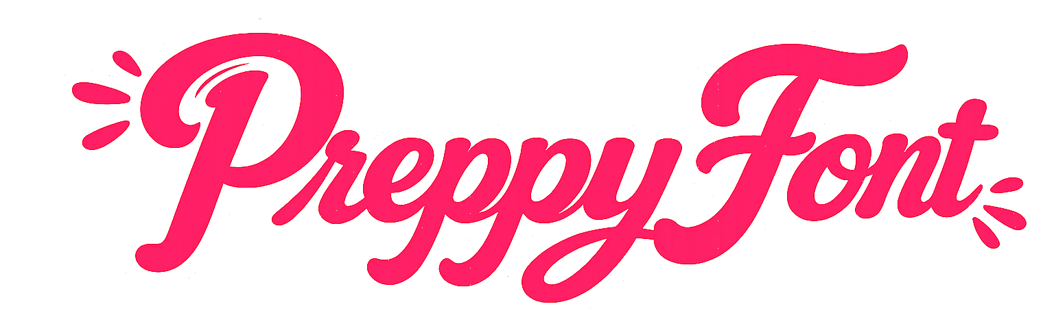
These three get used interchangeably, and they genuinely overlap — all pink-adjacent, all feminine, all built on the same platforms in the same few years. But they are distinct, and the differences are consistent enough to be useful.
The quickest way in is to ask what each one is doing.
- Preppy is signalling belonging.
- Coquette is performing.
- Soft girl is relaxing.
Everything else follows from that.
Preppy
Comes from: American prep schools, by way of a full TikTok revival that kept the palette and dropped the understatement.
Vocabulary: bows, tennis, pearls, stripes, blazers, monograms, bright pink.
Mood: tidy, sociable, slightly formal. Put-together in a way that suggests effort was made and then not mentioned.
In text: clean letterforms with light decoration. A script name with a bow either side is the signature move. Restraint matters — heavily stacked decoration reads as a different aesthetic entirely.
The full background is here if you want the longer version.
Coquette
Comes from: an older romantic-feminine tradition — think ballet, lace, and a specific kind of vintage styling — reassembled online.
Vocabulary: ribbons, lace, pearls, roses, lipstick, ballet shoes, cherries, bows again but different bows.
Mood: deliberately, almost theatrically feminine. Coquette is aware of itself. It is a performance of prettiness rather than an accident of it, and that self-awareness is the point.
In text: script, always. It is the closest Unicode gets to handwriting, and handwriting is what this aesthetic wants. Framed with ribbon characters — ʚ ɞ and ୨ ୧ do more work here than anywhere else.
Where it overlaps preppy: bows and pearls belong to both. The difference is styling — preppy bows are crisp and school-uniform; coquette bows are satin and slightly undone.
Soft girl
Comes from: pastel-heavy internet fashion, adjacent to but distinct from e-girl styling.
Vocabulary: clouds, hearts, blush tones, cherries, small stars, pale blue and cream alongside the pink.
Mood: gentle and unstyled. Where coquette performs, soft girl relaxes. It is the least effortful of the three by design — the look is meant to read as comfortable rather than composed.
In text: lighter-weight styles rather than bold ones, lowercase rather than capitals, and framing characters that feel drawn rather than printed. If a style looks sharp or high-contrast, it belongs somewhere else.
The lowercase matters more than people expect. Capitals add formality, which is precisely what this aesthetic is avoiding.
Side by side
| Preppy | Coquette | Soft girl | |
|---|---|---|---|
| Doing | belonging | performing | relaxing |
| Palette | bright pink, white | blush, cream, red | pastel, pale blue |
| Signature object | bow, tennis skirt | ribbon, lace, rose | cloud, heart |
| Letterform | script or clean | script, always | light, lowercase |
| Capitalisation | mixed | title case | lowercase |
| Decoration level | one or two symbols | framed both sides | minimal, soft |
The blurry edges
Being honest about where the distinctions break down:
Bows belong to everyone. The bow is the single most contested object across all three. You cannot identify an aesthetic from a bow alone.
Coquette and preppy have merged substantially. A lot of what gets tagged preppy on TikTok is closer to coquette by the definitions above. The labels are used loosely and nobody is checking.
Soft girl and coquette share the palette but differ on effort. If it looks like someone got ready, it is coquette. If it looks like they woke up like that, it is soft girl.
These are not rules. They are patterns that describe how the labels get used, and usage shifts. Anyone insisting on strict boundaries is over-formalising something that lives on mood boards.
Picking a style
The practical value of telling them apart is that it narrows the choice. Each has its own collection here:
- Preppy fonts — the full range
- Coquette — script and ribbons
- Soft girl — light and lowercase
- Kawaii — the adjacent one, if faces are what you want
- Fairy — if you want soft girl with more sparkle
Pick the aesthetic first and the font second. Working the other way round is why people scroll 368 styles and still cannot decide.